Table of Contents
ToggleChoosing a paint color for a living room feels simple until you’re standing in the paint aisle holding 50 color chips. Light paint colors remain the smartest choice for most living spaces, they reflect light, make rooms feel bigger, and create a calm backdrop for furniture and décor. But “light” covers a lot of ground: soft whites can feel sterile or warm depending on undertones, while pale blues create serenity and creamy neutrals add comfort. The right light color depends on your room’s natural light, layout, and what mood you want to establish. This guide walks through five proven palettes for 2026 that work in real homes, not just Instagram feeds, and includes practical tips for choosing the shade that actually fits your space.
Key Takeaways
- Light paint colors for living rooms reflect natural light, make spaces feel larger, and create a calm backdrop for furniture and décor while establishing the right mood for your home.
- Soft whites, pale blues, warm neutrals, and barely-there pastels are the five proven color palettes for 2026, each offering distinct benefits depending on your room’s natural light exposure and desired atmosphere.
- Natural light is the single biggest factor determining how light paint colors will look—test color samples on large swatches (at least 2×3 feet) across different walls for several days before committing to paint.
- Quality application matters: use eggshell or satin finishes, prime all fresh drywall or patched areas, and apply at least two coats to eliminate brush marks on lighter shades.
- Pair light paint colors strategically with trim, flooring, and décor—soft whites work with all styles, pale blues need warm metallics to avoid clinical aesthetics, and warm neutrals hide wear better in high-traffic living rooms.
- Light colors with subtle warmth or undertone work better than pure white or grayish neutrals in smaller spaces, and paint consistency across adjacent rooms like kitchens and dining areas creates visual harmony throughout your home.
Soft Whites And Creams: The Timeless Foundation
Soft whites and creams are the reliable backbone of light living room palettes. Unlike brilliant white, which can feel cold and laboratory-like, soft whites include subtle undertones, warm ivory, gentle gray, or barely-there yellow, that make a room feel settled rather than sterile.
Benjamin Moore’s Cloud White and Sherwin-Williams Alabaster are industry standards for good reason: they’re warm enough to feel inviting but light enough to reflect natural light and make walls recede. Cream-leaning whites like Benjamin Moore Chantilly Lace or Behr’s Crème add coziness without the yellow tinge that can date a space. These colors work on all four walls or as a trim color paired with a slightly warmer body color.
Cream colors sit a step darker and richer. Sherwin-Williams Accessible Beige (even though the name, it’s creamy) and Benjamin Moore Hale Navy’s warm cousin, Ballet White provide warmth without looking dated. Creams pair beautifully with white trim or darker accent walls.
Application matters. Use a quality eggshell or satin finish, matte can show fingerprints and dust in light colors, while gloss looks wrong in living rooms. Always prime fresh drywall or patched areas: light colors show unprimed spots. Two coats is standard: a third coat eliminates brush marks on lighter shades.
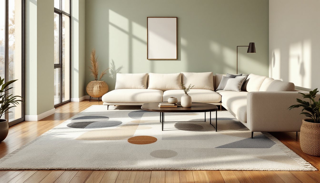
Pale Blues And Cool Grays: Creating Calm And Spaciousness
Pale blues and cool grays have regained traction because they genuinely deliver what they promise: a sense of openness and tranquility. These aren’t bold navy statement walls, they’re whisper-light versions that recede into the background while keeping a room visually larger.
Sherwin-Williams Sea Salt and Benjamin Moore Palladian Blue are pale blues with just enough pigment to feel intentional without overwhelming. Benjamin Moore Pale Oak leans blue-gray and works well in rooms with mixed lighting (some warm, some cool-toned fixtures). Cool grays like Sherwin-Williams Repose Gray and Benjamin Moore Stonington Gray are genuinely neutral but trend slightly cool, making them ideal if your trim is white or soft white.
These colors shine in rooms with northern exposure or spaces that get indirect, filtered light throughout the day. In rooms with strong afternoon sun from the west, cool colors can look washed out or grayish, test samples for a full day before committing. Pair pale blues with white trim, natural wood, or warm metallics (brass, copper) to prevent the space from feeling too clinical.
With cool colors, lighting matters. LED bulbs rated 3000K (warm white) or 2700K (soft white) keep a cool wall from feeling cold at night. Avoid daylight-temperature bulbs (5000K+) unless you want a contemporary, almost clinical aesthetic.
Warm Neutrals: Beige, Taupe, And Greige For Comfort
Warm neutrals, beige, taupe, and the hybrid “greige” (gray-beige blend), are the comfort food of paint colors. They’re not trendy or dramatic, which is exactly why they work. These colors feel approachable and pair well with nearly every flooring, trim, and furnishing choice.
Sherwin-Williams Accessible Beige, Benjamin Moore Balanced Beige, and Behr’s Taupe are workhorses that feel warmer and more dimensional than straight tan. Greige options like Benjamin Moore Revere Pewter (which skews slightly warmer) and Sherwin-Williams Urbane Bronze’s softer cousin, Urbane Bronze 7050 offer a modern, subtle complexity. These colors hide wear better than pure whites or creams, making them practical for high-traffic living rooms with kids or pets.
The risk with warm neutrals is choosing a shade too yellow or orange-forward, which ages quickly. Test samples on large swatches (not small chips) in morning, afternoon, and evening light. The undertones shift throughout the day. Pair warm neutrals with natural wood tones, warm white trim, or muted jewel-tone accents for visual interest without chaos.
Barely-There Pastels: Soft Greens And Peachy Tones
Soft greens and pale peachy tones bring subtle personality to light living rooms without the commitment of a bold statement wall. These barely-there pastels feel current in 2026 because they’re nature-inspired yet refined.
Benjamin Moore Healing Aloe is a whisper-soft green that feels organic and calming, popular because it doesn’t read as “nursery” or “spa.” Sherwin-Williams Accessible Green is another gentle option. On the warm end, Benjamin Moore Pale Oak (which leans green-gray) and Behr’s Palette 350 (a creamy sage-gray) work beautifully in rooms with natural light and wooden furniture.
Peachy tones like Benjamin Moore Pale Peach and Sherwin-Williams Cavern Clay add warmth without the yellow weight of true beige. These shades work best in rooms with consistent, cool to neutral light, too much warm south-facing sun can push them toward orange.
The key with soft pastels: commit fully. One wall in soft green with surrounding whites or creams can feel indecisive. Paint all walls, or choose a trim-only or accent approach. Pastels pair well with white or soft white trim, natural linens, and wood accessories. Avoid oversaturating the room with matching décor: let the color breathe.
Choosing The Right Light Color For Your Space
Assessing Natural Light And Room Dimensions
Natural light is the single biggest factor in how a color will look. A pale blue that’s serene in a north-facing room with filtered light can look cold and gray in a south-facing living room flooded with afternoon sun. Spend time observing your room at different times of day before painting.
Room size matters too. Large rooms with high ceilings can handle pale colors without feeling empty: small rooms benefit from light colors that reflect and expand visually. But avoid the trap of thinking “lighter is always bigger”, a very pale, washed-out color can actually make a small room feel bland and shapeless. Light colors with subtle warmth or undertone work better than pure white or grayish neutrals in smaller spaces.
Test properly. Buy sample sizes of 2–3 color candidates, paint large swatches (at least 2 feet by 3 feet) on different walls in your living room, and observe them for several days in natural and artificial light. Colors shift under different bulb temperatures and at different times of day. Don’t rely on small paint chips or online photos, they lie.
Consider adjacent spaces. If your living room opens to a kitchen or dining area, paint colors should have some harmony. A soft white in the living room with a warm beige kitchen feels intentional: abrupt shifts feel fractured. Trim consistency (all soft white, all cream) ties spaces together visually.
Conclusion
Light paint colors work in living rooms because they’re forgiving, versatile, and genuinely make spaces feel larger and more serene. Whether you choose soft whites, cool grays, warm neutrals, or barely-there pastels, success comes down to testing samples in your actual light conditions and committing to the full room, not half-measures. Measure twice, paint once, and you’ll have a living room that feels fresh and timeless in 2026 and beyond.