Table of Contents
ToggleAn accent wall can completely reshape a living room without gutting it or very costly. The right color choice can highlight architectural features, draw the eye toward focal points, or set the mood for how people actually use the space. Whether someone craves drama or calm, there’s a living room accent wall paint idea that fits their style and their home’s existing palette. This guide covers seven proven approaches, jewel tones, warm neutrals, bold primaries, soft pastels, and more, plus the practical considerations that separate a stunning accent from a project they’ll regret in six months.
Key Takeaways
- Jewel tones, warm neutrals, bold primaries, and soft pastels each offer distinct moods for living room accent wall paint ideas, so choose based on your lighting conditions and desired atmosphere.
- Proper wall preparation—including cleaning, filling cracks, priming, and sanding—is essential to achieve a professional-looking finish that rivals expensive professional work.
- Always sample paint on your accent wall for 24–48 hours under different lighting conditions before committing, since wet paint appears darker and room lighting dramatically affects final color perception.
- The best accent walls frame focal points like fireplaces, seating areas, or built-in shelving; avoid tight hallways and walls visible from multiple rooms in open floor plans.
- Jewel-toned accent walls benefit from warm ambient lighting (2700K bulbs) and matte finishes to prevent a cave-like appearance, while pastels require soft, layered lighting to avoid a flat look.
- Quality primer significantly improves color accuracy and adhesion, often reducing the number of finish coats needed—especially critical for bold colors and pastels.
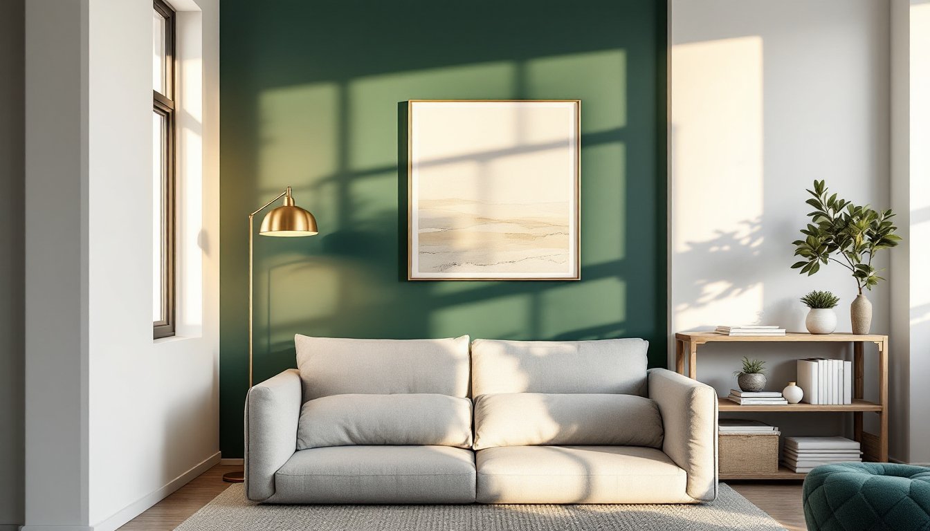
Moody Jewel Tones for Dramatic Impact
Deep emerald, sapphire, and jewel-toned purples command attention without screaming. These colors work best on the wall opposite a seating area or behind a media console, where they become a visual anchor. Jewel tones photograph well too, they look intentional rather than moody, even in photos.
The trick is lighting. In a room flooded with natural light, deep jewels feel lush. In darker spaces, pair them with warm ambient lighting (2700K bulbs work better than harsh white) to prevent the wall from feeling like a cave. Matte or eggshell finishes minimize glare and add sophistication: avoid high-gloss, which can feel dated.
Sample a large patch (at least 2 feet by 3 feet) and observe it at different times of day. Paint behaves differently under morning light, afternoon sun, and evening lamps. Buy a quart first, not a gallon. Allow the paint 24–48 hours to cure before judging the final color: wet paint always appears darker and more saturated than dry paint.
These bold hues pair well with neutral furnishings and allow artwork or architectural details to pop. A jewel-toned accent wall reads as curated, not chaotic.
Warm Neutrals for Timeless Sophistication
Warm grays, soft taupes, and greige (gray-beige blend) create depth without shock value. They’re the safe bet that actually works, not boring, but not a risk either. These tones anchor a room and let the rest of the décor take center stage.
Warm neutrals shine when layered with texture. A flat or matte finish reads as refined: semi-gloss looks too commercial. Pair the accent wall with natural wood furniture, linen upholstery, or warm metals like brass to reinforce the cohesion. The color complements photography walls, gallery installations, and floating shelves without competing for attention.
Because warm neutrals are forgiving, they work in spaces with variable lighting. North-facing rooms (which receive cool light) benefit from warm neutral accents to prevent a cold, uninviting feel. South-facing rooms also accommodate them without looking washed out.
Warm neutrals typically cost the same as standard interior paint ($30–50 per gallon in mid-range brands like Sherwin-Williams or Benjamin Moore). One gallon covers roughly 350 square feet, so a typical 10-by-14-foot wall needs just over half a gallon. Buy a quart for sampling first: don’t guess.
Bold Primary Colors for Personality and Energy
A vibrant navy, saturated red, or confident yellow energizes a space and reflects the homeowner’s personality. These colors demand confident execution, wishy-washy or muted versions feel amateur. Go bold or reconsider.
Red works on walls with traditional or transitional décor: it energizes dining or conversation areas. Navy reads as modern and pairs well with white trim and contemporary furnishings. Mustard yellow works in eclectic or mid-century inspired spaces but can feel dated if the rest of the room doesn’t support it.
The challenge: bold colors require excellent surface preparation. Any imperfections in the wall (drywall mud ridges, patching, uneven texture) become glaringly obvious under saturated color. Spend extra time sanding, filling, and priming. Use a quality primer, a tinted primer in a shade near your final color reduces the number of finish coats needed and ensures better coverage.
Bold accent walls work best in smaller rooms or where they can frame a focal point (fireplace, built-ins, or large windows). In very open floor plans, a bold accent can feel jarring if it’s not anchored by furniture placement or architectural edges.
Expect to apply two coats of quality paint. Allow 24 hours between coats.
Soft Pastels for a Calming Aesthetic
Pale sage, dusty blue, blush, or soft lavender create a serene, retreat-like atmosphere. Pastels work exceptionally well in homes where the living room doubles as a relaxation space or opens into a bedroom.
Pastels are deceptive. They’re not simply lighter versions of bold colors, they’ve been desaturated and tinted with white, which changes their undertones. A pastel blue might lean green or purple depending on its composition. Always test samples on the wall in your specific lighting conditions. What looks appealing in a showroom can veer too pink or too gray in your home.
Pastels pair beautifully with natural textures: linen, cotton, wool, and exposed wood. They also complement botanical art, woven accents, and soft furnishings. In rooms with cool (blue or purple) undertones, pastels enhance the existing ambiance. In warm spaces (yellow or orange undertones), cool pastels can feel disconnected unless balanced with warm accents elsewhere.
One potential downside: pastels can feel flat under harsh overhead lighting. Soft, layered lighting (table lamps, wall sconces) makes pastel accent walls come alive. They also show dust and fingerprints more readily than darker colors, so keep the wall relatively traffic-free.
Choosing the Right Wall for Maximum Visual Impact
Not every wall qualifies as an accent wall. The best candidates frame or anchor the room’s focal point.
The wall behind a sofa or seating arrangement works well because visitors see it as they enter and sit. This wall commands attention without overwhelming the space. Avoid accent walls behind doors or windows unless the architectural interest justifies it.
The wall with a fireplace, built-in shelving, or architectural detail naturally draws the eye, these are excellent accent candidates. A wall opposite the primary seating area also works because it becomes a visual destination.
Skip accent walls in tight hallways or narrow alcoves where the color can feel claustrophobic. Also, think twice about accent walls visible from multiple rooms in an open floor plan. A bold color that looks great in the living room can feel jarring from the kitchen if they’re sightlines are connected.
Measure the wall before buying paint. A 10-by-14-foot wall is roughly 140 square feet. Standard interior paint covers 350–400 square feet per gallon, so one gallon is more than enough for most living room accent walls. One quart works for samples and smaller walls.
Design Considerations and Practical Tips
Surface Preparation: The difference between a professional-looking accent and a sloppy job is prep work. Wash the wall with a damp cloth to remove dust and cobwebs. Fill holes and cracks with lightweight spackling compound, sand smooth once dry, and wipe away dust. Caulk along trim edges for clean lines. These steps sound tedious but prevent paint from adhering unevenly or showing imperfections.
Priming: Many DIYers skip primer on primed drywall and regret it, especially with bold colors or pastels. A primer creates uniform adhesion, improves color accuracy, and often reduces the coats of finish paint needed. Sherwin-Williams ProClassic or Benjamin Moore Advance primers work well. Use a primer-paint combo only if the manufacturer guarantees coverage: otherwise, primer and paint in separate steps is more reliable.
Application: Use a quality roller (a 3/8-inch nap for smooth walls, 1/2-inch for textured surfaces) and angled brush for trim. Paint the perimeter with a brush first, then roll the field. Maintain a wet edge, don’t let the paint dry between sections, or lap marks will show. Most modern interior paints need just one coat of finish paint over primer, but bold or light colors may need two.
Trim Decisions: Decide whether the accent wall will have colored or white trim before you start. White trim around a bold accent creates sharp definition: matching the wall color creates a seamless look. Colored trim is valid but harder to execute cleanly without painter’s tape and extra care. Mark trim lines with low-tack painter’s tape and seal it with a straight edge for clean edges. Remove tape while the paint is slightly tacky (not bone-dry) to avoid peeling the finish.
Safety and Ventilation: Open windows and use a fan to ventilate, even with low-VOC paints. Wear safety glasses and keep paint off skin and eyes. If using a ladder, ensure it’s stable and don’t overreach: it’s worth asking a helper to stabilize it.
Conclusion
An accent wall is a manageable DIY project that transforms how a living room feels. Whether the goal is drama, calm, or subtle sophistication, the right color choice, paired with honest surface prep and careful execution, delivers results that rival professional work. Start with a small sample, observe it through a full day’s lighting cycle, and commit only when confident. The investment is time and paint, not thousands of dollars.